Standard Celeration Charts
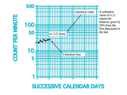
The standard celeration chart is a method of charting and analyzing changes over time. Ogden Lindsely invented this charting technique in the 1960s. The are 4 different types of charts which scale across the horizontal axis. There is the daily (140 calendar days), weekly, monthly and yearly charts. The daily chart is the one that is most often used in practice. It is called a standard chart because it is a consistent display of frequency of change over time (celeration). If the change is positive, it is acceleration and if it is decreasing it is deceleration.
Precision teaching is a teaching system that was developed to work in concert with the standard celeration chart. This teaching system focuses on learning measured in terms of response rate. For example, number of math problems done in a certain amount of time. If the frequency of problems solved can increase, then acceleration has been achieved. The number of correct or incorrect math problems is not considered into the measurement of celeration, only the number of problems solved.


Leave a Reply
Want to join the discussion?Feel free to contribute!